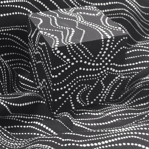
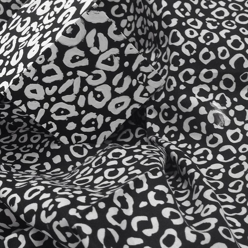
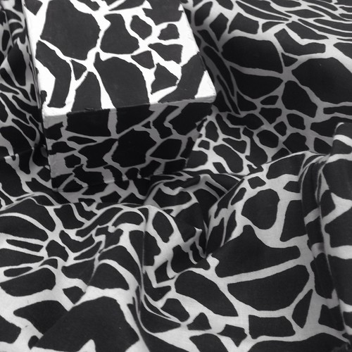
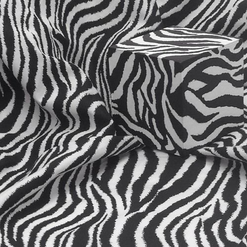
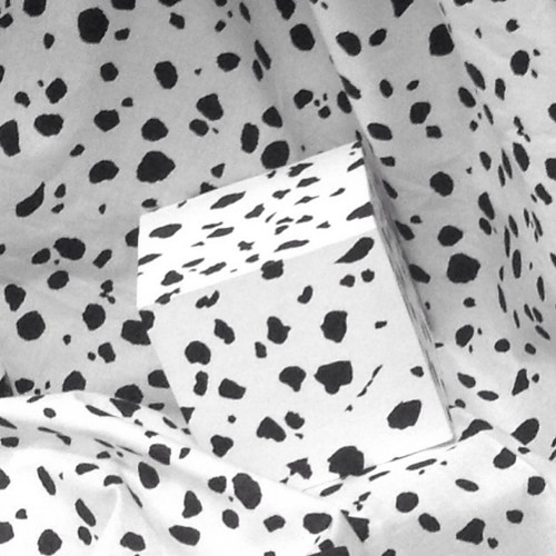
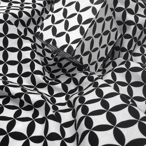
The photo on the top left is of my cube. The rest of the photos are of the cubes of my talented classmates in ARCH 218 in Fall 2013.
I am in the second week of the Fall semester and just completed the first project for a design studio class that I am taking to help beef up my portfolio. For this first project I had to take a black and white printed fabric and paint it onto a 4" x 4" cube, taking into consideration the folds and creased that the fabric creates when it is crumpled up. At first glance, the project sound super difficult. But after careful consideration of fabric pattern and my own artist capability up to this point, I decided upon an abstract dot pattern over a floral fabric pattern. While working on this project, I discovered how to merge the cube with the fabric pattern so that they become one. First, I noticed that the dots on the fabric pattern all ran in one direction so I decided to paint the pattern so that it ran both horizontally and vertically on the cube in order to capture the wrinkles and folds of the fabric. Second, I discovered that by painting the pattern so that it wraps around the sides of the cube helps eliminate the sharp edges of the cube. In the photos above, you can see how at least one, two or even three sides on the cube disappear into the pattern on the fabric. So the question is did I turn the fabric into the cube or did the cube turn into the fabric? Overall, the purpose of this project was to understand how negative and positive space lay within our visual perception and how it makes us think twice about how we perceive our surrounding environment.


No comments:
Post a Comment